
AI & Building
A More Complex Vibe-Coding Workflow Isn’t Always Better
What actually improved my results: a clearer creative brief, a capable builder and reviews with a specific job.
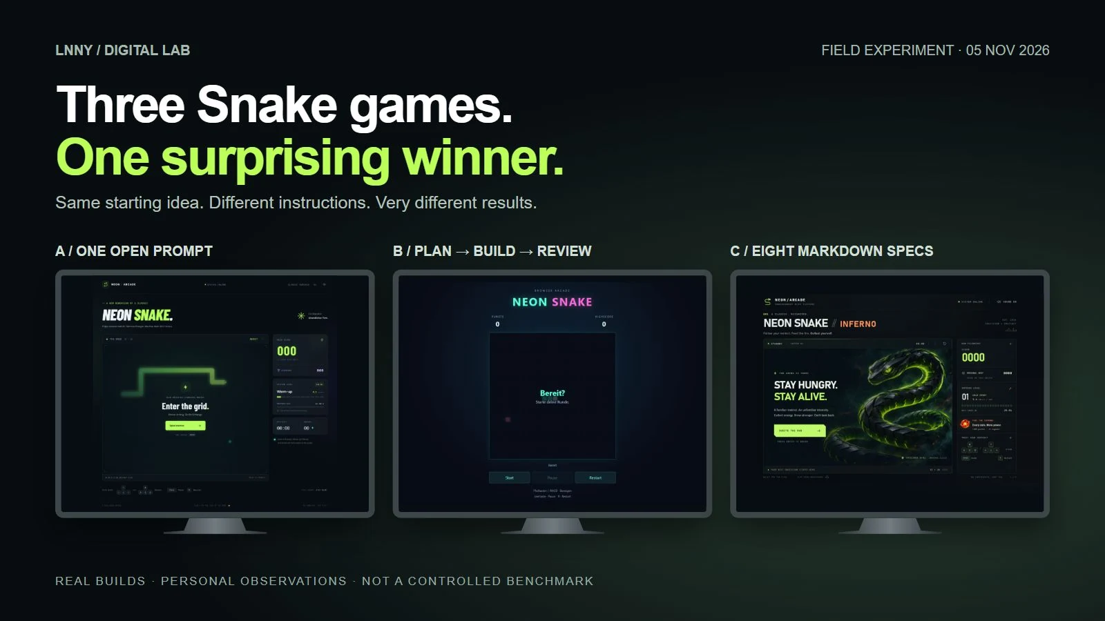
It is tempting to make vibe coding feel more professional by adding more steps: first a planner, then a builder, then a reviewer. I tried that on a small browser-game project. The result worked, but I preferred the design of the version built from one relatively open prompt.
The bigger improvement came later, when I gave the builder a much clearer description of the experience I wanted. Design, sound, feedback and technical expectations were made explicit before implementation. That version became my favourite.
The lesson I am taking away is not “never plan.” It is to ask what each step is supposed to improve. A detailed workflow cannot replace a clear idea of what good should look and feel like. Here is what I would carry into my next small creative project—and what this experiment cannot tell us.

THE PERSON BEHIND THE PROJECTS
Lenard Schwenkschuster
Web design, vibe coding & application expert. I build and test browser tools, games and my own CMS, with a background in digital media and frontend development.
Define quality before you design the workflow
Before choosing how many stages or agents a project needs, I would now describe what a successful result actually means. A working feature list is only part of that. In a browser game, it includes responsive controls, understandable feedback, pace, sound and a visual identity I want to return to.
My test case was three versions of a neon Snake game. A started from one open prompt. B used separate planning, implementation and review phases. C went back to one coherent build, but with eight Markdown specifications defining the intended experience. A later received a separate review and targeted fixes, becoming A+. The screenshots below are the evidence behind the lessons, rather than the point of the article.
The experiment in brief
| Approach | What happened | The useful question |
|---|---|---|
| A: one open prompt | I preferred its design to the staged build, but later review still found bugs. | Does the prototype deliver the experience, as well as the features? |
| B: plan → build → review | Review found useful functional issues; the extra stages did not produce my favourite design. | What does each additional stage actually improve? |
| C: a stronger specification, then one build | My favourite for design, sound and game dynamics—with richer requirements than A or B. | Have I clearly described the qualities I expect? |
This was not a controlled benchmark. Reasoning settings and instructions differed, and C explicitly asked for qualities the earlier briefs had not spelled out. I can describe what worked for me; I cannot isolate one variable and claim it caused the improvement.
More handoffs do not create better art direction
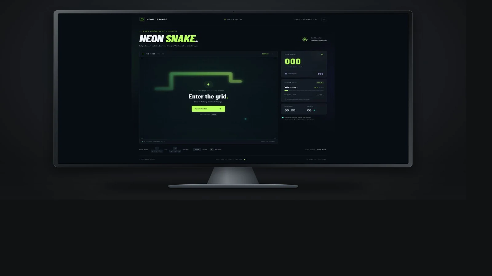
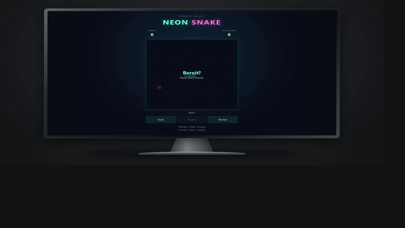
The staged build was functional, but looked more like a standard implementation: a grid, score and buttons. The open-prompt version had a more distinctive arcade interface, stronger typography and a more considered HUD. More process had not automatically produced more character.
My practical takeaway: do not assume a planning step will supply your creative direction. Describe the visual hierarchy, atmosphere and interaction qualities that matter to you. Then look at the actual result. A technically organised implementation and a convincing design are different questions.
For your next project, write down three observable signs of quality before building. “The main action is obvious without an explanation” is something you can inspect. “Make it premium” leaves much more open to interpretation. That is a briefing habit I would try next, rather than a technique this experiment has independently proven.
Give a review a specific job
Review earned its place when it looked for concrete failures. In the staged build, it found lost active time around pause or restart, and a stale second tab overwriting a higher highscore. Those findings were reproducible and could be fixed. That is a much clearer contribution than simply asking another agent to “make it better.”
I would separate creative judgement from bug review. First, use the prototype and decide whether its direction is worth keeping. Then ask the reviewer to reproduce functional problems, explain the expected behaviour and provide regression tests. Tell it which design and UX decisions must survive.
The screenshot below shows the visually simpler build. Its review still did useful work. A result can teach me something technically without becoming my preferred creative direction.
Green tests only answer the questions you asked
The first build passed all 17 existing tests. A later independent review nevertheless reproduced four additional issues: stale-tab highscore handling, lost simulation time on slow frames, tones continuing after mute, and interrupted multitouch control.
That changed how I read a test summary. A green result tells me the checked scenarios passed. It does not tell me every important scenario was included, or whether I will enjoy using the result. Before asking for more tests, I want to ask: which behaviour are we still uncertain about?
The useful follow-up was targeted repair, with the visual design protected. Only game.js changed among the production files in the A+ fix. The existing report documents the original 17 tests and 12 supplementary checks passing, with a timing-test route corrected as disclosed in the report. This was evidence for those fixes, not an exhaustive cross-browser guarantee.
A review prompt I would reuse is: reproduce the mismatch first, add a test that demonstrates it, fix the cause and check that the approved experience survives.
Keep the existing visual design, layout, styling, animations and UX unchanged. No redesign, no new features, no unnecessary refactoring.
Lenard Schwenkschuster — original review/fix instruction, translated from German
Describe the experience before you add more process
The most interesting improvement came when I changed the brief. Instead of relying on the agent to infer what “a good game” meant, I supplied a structured specification covering the intended experience as well as the rules.
The package happened to contain eight Markdown files. Eight is not a magic number. These were the dimensions it covered; for a smaller project, some could fit into one short document:
- Purpose: what the user or player should repeatedly do, and why it is worth doing.
- Visual direction: hierarchy, atmosphere and the design qualities that should be recognisable.
- Interaction feel: responsiveness, feedback and how actions should affect the experience.
- Behaviour: explicit rules, states and edge cases.
- Assets and sound: what should be created, what can be reused and where placeholders are unacceptable.
- Technical boundaries: what needs separation and which constraints matter.
- Acceptance criteria: what you will inspect to decide whether the result is good enough.
- Scope: what belongs in this version and what should wait.
Those specifications left implementation choices open while making the intended effect much clearer. The builder was also explicitly asked to use generated image assets where available, and to implement sound and effects.
If one of those qualities matters to you, put it in the brief. It is hard to fairly criticise a build for omitting an experience you never clearly requested.
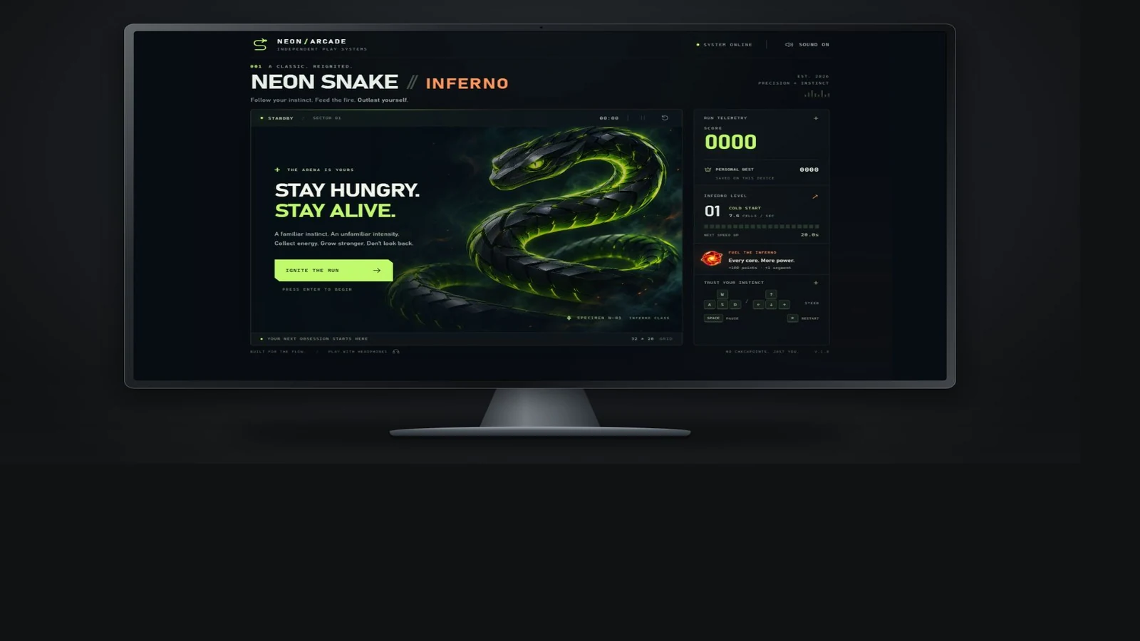
Better design, sounds and game dynamics—but to be fair, we had not explicitly asked for those things in the other games.
Lenard Schwenkschuster — follow-up interview, 5 November 2026; translated from German
That was my verdict after playing: design, sound and game dynamics made the result feel better. But the qualification matters as much as the praise. C received a richer creative brief. We cannot attribute the improvement solely to Markdown, fewer handoffs or a particular model setting.
For me, the reusable lesson is to invest effort in the information the builder needs. Adding another phase is useful only if it resolves a problem the existing workflow is leaving open.
A workflow to try on your next small project
- Write the intended outcome and a few observable quality criteria before implementation. Keep your own creative direction explicit.
- Give a capable builder one coherent, focused first version to deliver. Do not lower the implementation effort and assume a strong review will compensate.
- Use the result yourself. Record concrete mismatches between what you expected and what actually happened.
- If the direction is good, ask an independent reviewer to reproduce functional problems while preserving the parts you approve.
- Apply targeted fixes and recheck both the repaired behaviour and the experience you wanted to keep.
- Add planning or another handoff when you can name the uncertainty it will resolve.
When is more planning worth it?
I would use a planning conversation when I cannot yet explain the behaviour I want, when choices depend on one another, or when a wrong assumption would be expensive to undo. I would ask it to show the options and tradeoffs, rather than quietly inventing the creative direction for me.
Those are recommendations I take from the experience, not outcomes this three-build comparison has measured. This experiment was small. It tells us little about work involving many contributors, existing production systems or safety-critical requirements. In those situations, additional structure may address concerns that never appeared here.
There is another limitation worth keeping in view: the open-prompt build used Very High reasoning, while the staged implementation used Low/Medium reasoning, with stronger settings for planning and review. The difference in results does not establish that planning itself made B worse.
My decision rule is therefore a question: what specific risk, ambiguity or quality gap will this extra step address? If I cannot answer that, I would first improve the brief or inspect the prototype.
A better brief to copy
This is a new template derived from the lessons, not an original chat prompt. Adapt it for a small website, tool or game:
Read the project brief before writing code.

Build one focused, usable first version of [project].
The user should be able to [core task].
The experience should feel [specific qualities].

I will judge the result by these observable criteria:
1. [Visual or interaction criterion]
2. [Functional criterion]
3. [Feedback, performance or accessibility criterion]

Keep these creative decisions: [direction to preserve].
Include these assets and feedback: [specific requirements].
Leave these features for later: [scope boundaries].

If a key requirement is ambiguous, explain the options
and ask before committing to an assumption.
Implement the first version as one coherent piece of work.
Report what you tested and what is still uncertain.

After I have used it, review the concrete issues I identify.
Reproduce bugs before fixing them. Preserve the approved
design and avoid unrelated features or redesigns.
Judge the result, not the complexity of the process
What I want to keep from this experiment is a useful division of work: I supply the creative intent and judge the experience; the builder implements it; a reviewer investigates problems with a clear remit. That is a workflow I want to keep testing, not a universal formula.
The three demos above let you inspect the concrete examples behind these observations. A serves the reviewed A+ version, B includes its QA fixes, and C is the current richer-brief build. They are companion experiments, not frozen snapshots of every earlier stage or entries in my main games catalogue.
For related experience, read how I build and judge browser-game prototypes, what building my own CMS taught me or how everyday annoyances became practical tools.
The biggest lever was not the number of prompts. It was making sure the agent understood how the finished product should feel and look before building it.
Lenard Schwenkschuster — conclusion from the Snake field experiment
About this experiment
These lessons come from my Snake A, B, A+ and C projects on 5 November 2026: project conversations, local files, review reports and my own play impressions. The quote about design, sound and game dynamics comes from a short follow-up interview. Screenshots show actual interfaces inside illustrative monitor frames; C includes AI-generated game artwork.
Before hosting these review copies, the 17-test A+ suite, expanded 21-test B suite and 35-test C suite were rerun successfully. Those suites cover different scenarios and their totals are not comparable quality scores. Historical audit findings are attributed to existing reports. Model settings, instructions, assets, test scope and development time were not held constant; preferences about design and game feel were mine, not results from a blinded panel.
The practical suggestions in this article extend my observations into a workflow to try. They are not an external benchmark or a claim that a simpler process is always better. Prepared with AI assistance and awaiting my editorial review.